
TIGRESS
branding - print design
Tigress is a social justice publication that illuminates testimonies of Asian Americans, fights against racism, and reclaims cultural traditions. Appealing to younger adolescents of the AAPI community, Tigress captivates its readers through its bold use of typography and imagery while pushing back against preexisting stereotypes about Asian Americans.
The choice of the name Tigress was an intentional reclaiming of the term “tiger mom” and experience of being titled “exotic” due to a skin color or facial feature. Tigress is intentionally bold and expressive, breaking through the model minority stereotype that Asian Americans often receive.
Look & Feel

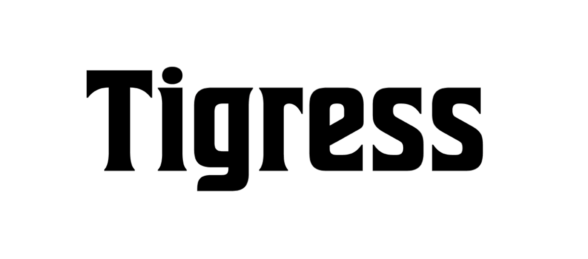
I was inspired by the different language systems throughout Asia when creating Tigress’s wordmark. I wanted to focus on honoring the variety of symbols and letter forms throughout the continent while also emphasizing the boldness and adaptability that Tigress highlights in the Asian American community.
Wordmark Process


By challenging myself with freeplay type manipulation, I explored showcasing the themes of the magazine content through typography. This process involved printing and physically exploring different methods to obscure or emphasize the content.
Typographic Experimentation


As I continued to map out different visual elements of the layout, I needed to build the grid in which the body body and imagery would be structured around.
Design System

Tigress challenges the expectations of an AAPI publication with its bold use of freeplay type manipulation. With an intention to expand the Western perspective of who is a part of the AAPI community, Tigress leaves allowances for future publications to highlight different Asian countries and monthly festivals to emphasize the importance of cultural ties.
Final


This project acted as an introduction to creating a wordmark and the intricacies of type manipulation methods. By creating the concept of the magazine first, I was able to establish characteristics for the type language to adhere to as the wordmark and publication layout followed.